Insights is a deliverability-monitoring feature inside Smartlead's Automations. It checks your sending setup on a schedule, flags anything that needs attention, and gives you a way to fix it from the same page.
Insights is being rolled out in parts. Today it covers one area - mailbox health - with domain-level and campaign-level views planned to follow. This article covers the Mailbox view: what it checks, how to read it, and how to fix what it finds.
Log in to your Smartlead account.
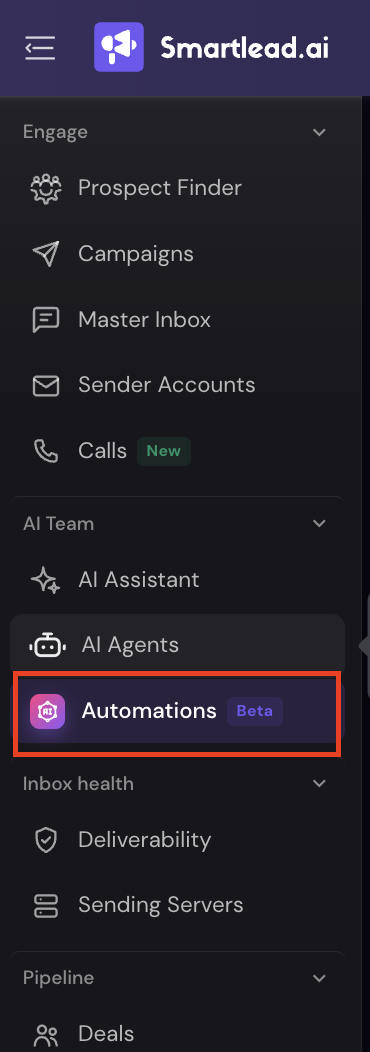
In the left-hand menu, under AI Team, click Automations.
In the Automations panel, click the Insights icon in the left rail.
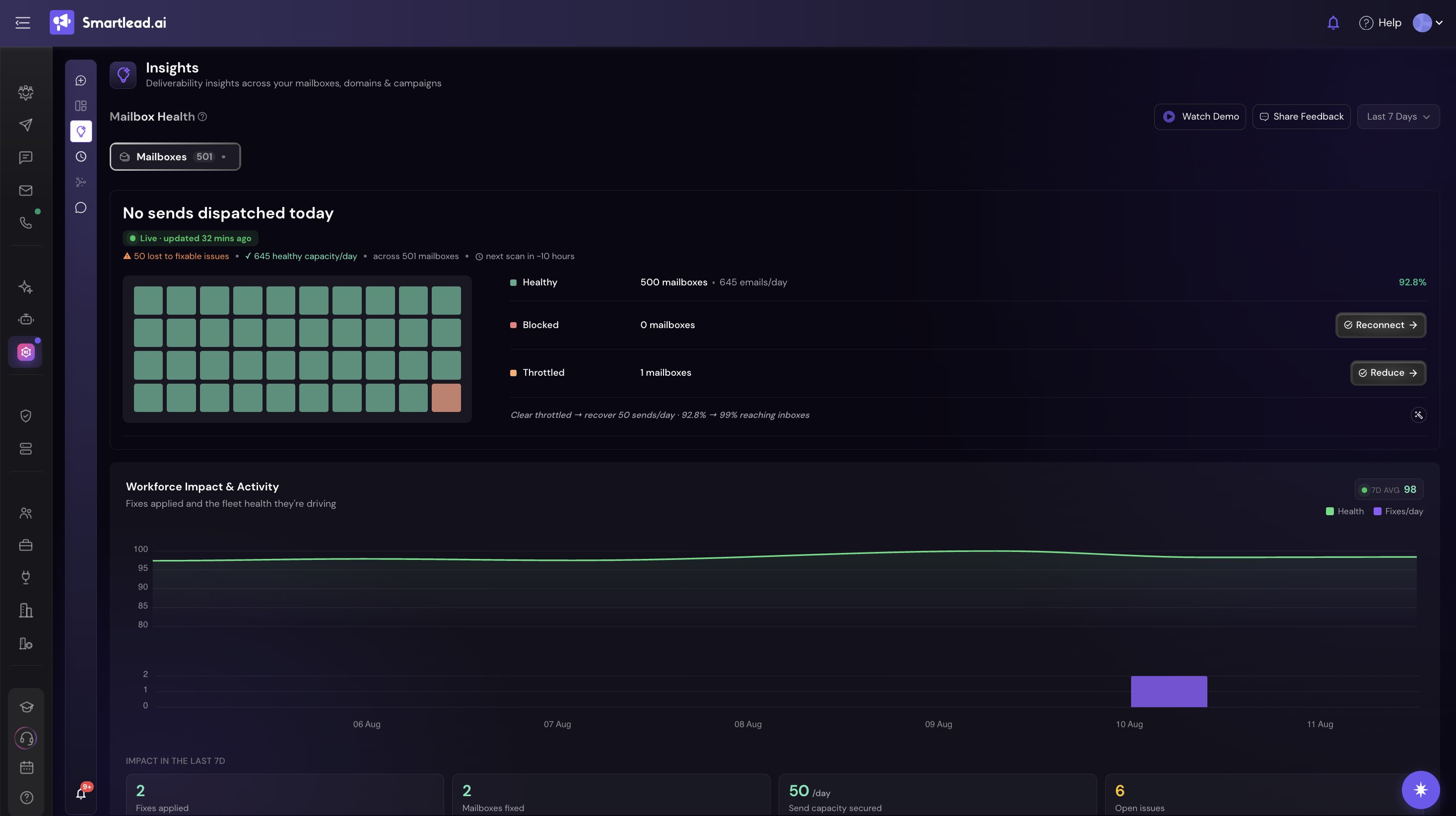
You'll land on the Mailbox view, showing sends dispatched today, a Live badge, and a countdown to the next scan.
Use the Last 7 Days / Last 14 Days toggle at the top right to change the time range - every metric on the page re-scopes with it.
Insights scans every mailbox in your account daily and sorts each one into a status - Healthy, Throttled, or Blocked. Everything on the page builds off that scan: a top-level summary of your fleet, a record of what's already been fixed, trend charts, and the specific issues still open. Here's what each part shows you.
At the top of the page, the Mailbox Health hero shows sends dispatched today, a Live badge with a countdown to the next scan, and:
⚠ how many sends were lost to fixable issues
✓ your current healthy capacity/day
how many mailboxes that's calculated across
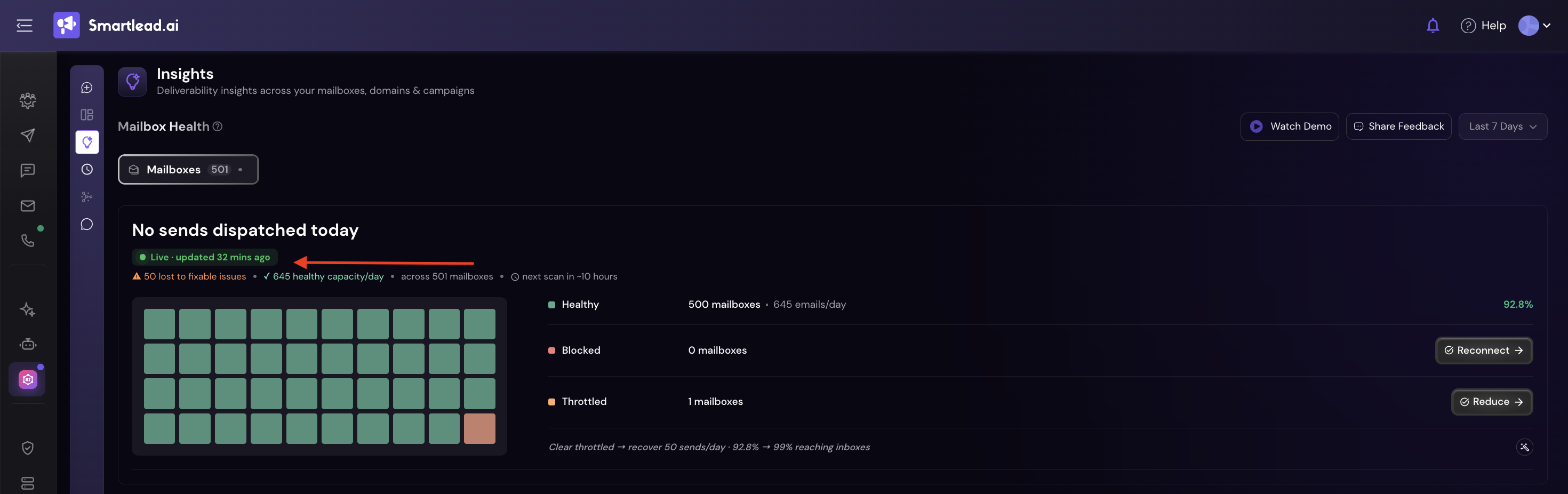
The grid underneath gives you one square per mailbox - green for healthy, orange for throttled, red for blocked. The panel beside it breaks the fleet down into:
Healthy - mailbox count + combined emails/day capacity.
Blocked - mailbox count, with a one-click Reconnect action.
Throttled - mailbox count, with a one-click Reduce action.
When you have throttled mailboxes, the panel adds a line quantifying the payoff of clearing them - for example, how many more sends/day you'd recover and how much closer your fleet would get to full inbox placement.
Below the health grid, this section plots your fleet's health score against fixes applied per day. Underneath the chart are four running totals for the period you've selected:
Fixes applied
Mailboxes fixed
Send capacity secured (as a /day figure)
Open issues still waiting on you
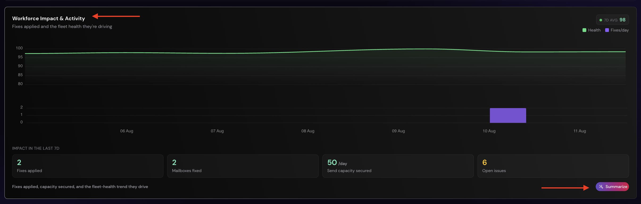
A Summarise button on this section turns the chart and totals into a short written explanation of what's happened, so you don't have to read the trend yourself.
Further down, three trend charts give you the numbers behind fleet health:
Sends/Day - your actual daily send volume against a target (e.g. 240/day), with days marked as Below Limit or Above Limit.
Bounce Rate - trended against Healthy (under 3%) and Action (5%+) thresholds.
Replies/Day - actual replies against your fleet's potential reply volume.

Each view shows a % change versus the prior week, so you can catch a trend before it turns into a card in Mailbox Issues.
Not everything can be resolved automatically - some issues need a decision or a sign-in only you can make.
Those show up here, grouped into four cards, each benchmarked against a healthy fleet so you can tell how far off you are before acting.
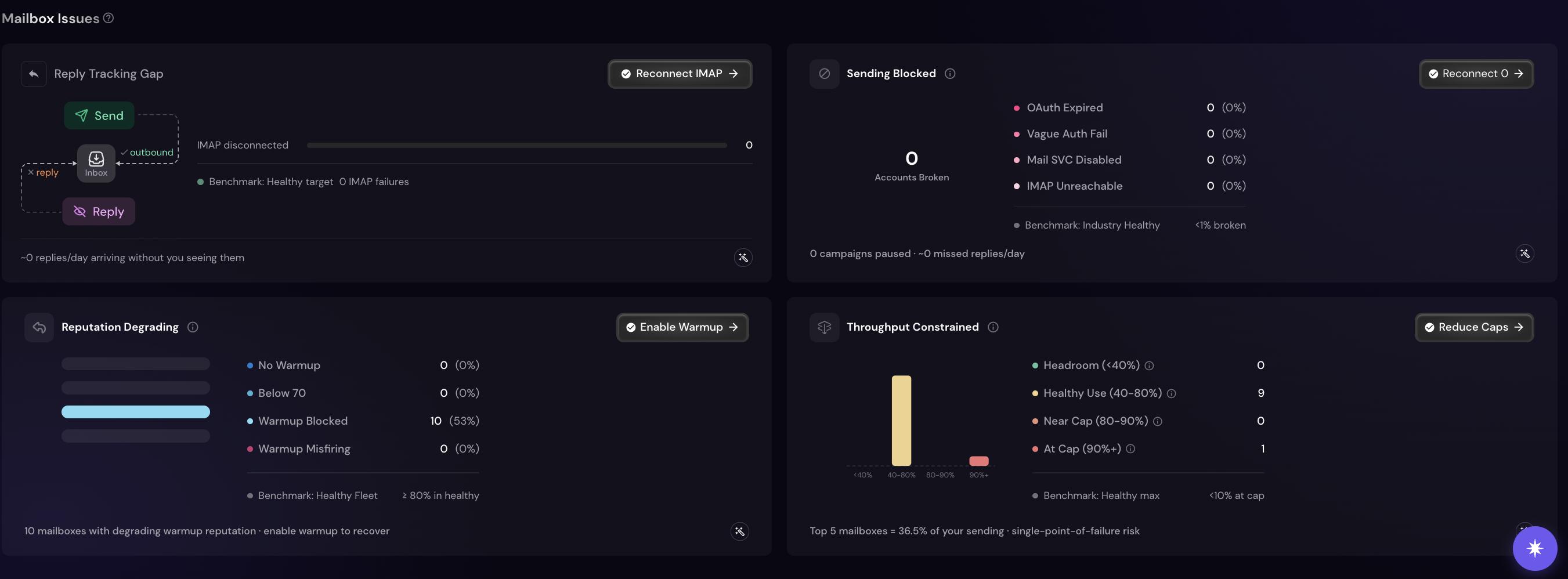
Reply Tracking Gap - a send/inbox/reply flow shows where replies are getting lost, with an IMAP-disconnected count against a "0 IMAP failures" benchmark. Fix with Reconnect IMAP. The card also estimates how many replies/day are arriving without you seeing them.
Sending Blocked - breaks down broken accounts by cause (OAuth Expired, Vague Auth Fail, Mail SVC Disabled, IMAP Unreachable), each with a count and % of your fleet, against an industry benchmark of under 1% broken. Fix with Reconnect. Also shows campaigns paused and estimated missed replies/day.
Reputation Degrading - breaks mailboxes down by No Warmup, Below 70 (warmup score), Warmup Blocked, and Warmup Misfiring, against a healthy-fleet benchmark of 80%+ mailboxes in good standing. Fix with Enable Warmup.
Throughput Constrained - a bar chart of mailboxes by capacity band (Headroom under 40%, Healthy Use 40–80%, Near Cap 80–90%, At Cap 90%+), against a benchmark of under 10% of mailboxes at cap. Also flags if your top 5 mailboxes carry an outsized share of total sending - a single-point-of-failure risk. Fix with Reduce Caps.
Cards also have a Summarise button, which turns the card's numbers into a short explanation of what's wrong and what action would fix it.
You can filter issues by type (No Warm-up, Below 70, Blocked, Misfiring) or by email provider, and use Fix all N to resolve up to 50 mailboxes in one click - reconnects run through a guided sign-in queue, and results are verified before being marked fixed.
If your workspace has IMAP disabled at the tenant level, the reconnect action changes to Contact admin and gives you clipboard-ready text to send along, instead of opening a sign-in popup that would fail.
Scans run automatically once a day; you don't need to trigger them manually.
After a fix, give it up to 24 hours - the system re-checks and reports the outcome on your next login, whether or not the fix worked.
The Share Feedback button at the top of the page goes straight to the product team - use it to flag anything that looks off.
The Mailbox view is the first of three planned views inside Insights (Mailbox, Domain, and Campaign). Domain and Campaign views, along with Future Risk and Idle Capacity cards, are still in testing and not yet available. A "More insights coming soon" note on the page reflects this.
Insights gives you one place to see what your account has already fixed on its own, and what's still left for you to close out - starting with mailboxes today, and expanding to domains and campaigns as those views roll out.